Two catch phrases that quickly are becoming mainstream in the fire service are data-driven and data-assisted. Although private industry and nearly every other aspect of modern life adopted data decades ago, the fire service generally has done a poor job of keeping pace. That said, before you begin to rectify this situation and incorporate data into your system, you should go back to the basics to understand what’s available, how it can be used and opportunities to leverage it to support your mission.
Whenever I lecture to the informatics students at Indiana University, I always go over three main points with them. First, data scientists will play a huge part in the evolution of public safety. Second, if you have enough data points and account for all variables, you can forecast the future. Finally, data without a frame of reference or relevance is useless. Here, the focus is on the last point.
Fire/emergency service data
The average firefighter or fire officer who generates a sizable portion of the data that are produced in a department rarely truly understands the importance of the reports that they fill out. Reports that pertain to training, activities, incidents, accidents, preplans, inspections and risk reduction education generate invaluable information when they are filled out accurately.
What lies under these reports is another useful layer if a department uses computer-aided dispatch, automatic vehicle location (AVL), geographic information systems (GIS) and other such technologies. Beyond these layers of information is the proverbial iceberg hiding under the water that includes meta data, cellular device tracking, and a growing list of data sources that’s generated by smart city and smart building technology.
No matter the amount of available raw data, without a frame of reference, the data are like a trash heap. Experienced managers often can sort through the numbers and find useful scraps of information, but they rarely get past the surface of what’s truly available.
Visualizing data
In the evolution of data use, the trash heap of raw data is overwhelming and isn’t digested easily. Not only is it difficult to understand, but it also lacks functionality as usable intelligence. Even when sorted, filtered or put into a pivot table, the data often are confusing to the average person.
Most departments evolved to the stage of data usage by which they convert data into charts and graphs. Compared with thousands of data lines, these charts and graphs supply context as percentages, show trends over time and/or indicate progress toward a goal. Although they often are used to look back at historical data and are useful for decision-makers, they rarely offer real-time intelligence that help frontline staff.
Power BI and Tableau are examples of visualization tools that improve the usefulness of charts by allowing a user to interact with them. These tools allow users to sort and adjust the data, which are added frames of reference. The barrier to using these tools is relatively low. They generally require a subscription fee and a few hours of online education to generate impressive visualizations. This said, although this step of data evolution adds a frame of reference, it falls short on the relevance aspect.

GIS: ultimate visualization
I specifically refer to data as layers, because this is the true power of perhaps one of the most useful visualization tools that’s available to fire departments.
GIS can show where data points exist. What can make data more relevant than showing how close to your vicinity that the data are occurring?
Let’s face it, society, in general, has major misconceptions about emergencies that lead to complacency or a lack of support for fire and emergency services. The biggest misconception, in my opinion, is “It won’t happen here.” When you show someone where these things are occurring, data suddenly add a little relevance to their life. The more information that you have with geo-tags, geo-verified addresses and/or latitude/longitude coordinates, the easier that it is to add reference and relevance.
Each data source can become a layer that’s added to a map. Roads, buildings, hydrants and utility grids represent only a fraction of what you can build into these visualizations. Past calls for service that are filtered by call type, travel time estimates, hazmat transportation routes, forest canopy analysis data and drone flight data all can be more layers.
Compared with every other data visualization tool, GIS is the ultimate community engagement tool. Want to generate support for a new fire station? Show a map that outlines response time gaps in that area compared with call volume. Want to generate political support for the department? Show politicians the issues that affect their constituents. Pictures are worth a thousand words. Even without a skilled storyteller at the helm, GIS tools help to paint the picture in a manner that’s easy-to-understand and relevant.
Although most of these tools are slightly more expensive to obtain and use for public safety purposes than are visualization tools, companies, such as Esri, offer powerful, firefighter-friendly options for organizations that own a user license (ArcGIS in the case of Esri). Often, GIS analysts are recommended, to take full advantage of these options, but dedicated personnel can take online courses to learn how to use them.

Preplanning and GIS
What two key pieces of information are required to reach a 9-1-1 dispatch decision? They are the nature of the emergency and where it’s occurring.
Everything that frontline staff face is out in the area that they serve. Of course, members are trained to make split-second decisions with limited intelligence on what they are dispatched to mitigate. What if members had relevant information that’s relatable and at their fingertips in the minutes that they take to respond to an emergency?
I remember spending hours working on preplans, only to have them sit in a binder and gather dust. Even if I knew where we were going, the time that it would take to dig through the milk crate of binders wasn’t a workable option.
Since we already know where we are going, GIS-powered applications can bridge the gap to supply useful information about the places that we preplanned and/or inspected. Some solutions, including First Due, go as far as to bring in any relevant open-source data, such as census data, building department records, construction permits and scanned blueprints.
As buildings become smarter, the capability to use real-time data about a building is on the horizon. Taking this concept beyond buildings with addresses, GIS mapping for wildland urban interface (WUI) planning is key to protecting the community. For coastal regions, mapping that tracks tropical storms/hurricanes, evacuation route traffic conditions and known flood zones at various stages is an absolute necessity to prioritize responses.
Real-time intel
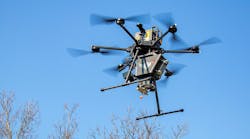
When GIS and other technologies, such as AVL, personnel telemetry and drones, are coupled together, the result is real-time data. This is quite possibly one of the most exciting aspects of endeavors that involve GIS technology.
As someone who has gone door to door after a major storm to check for people, the efficiency of chalk or paint markings on a door is limited. In several large-scale natural disasters, GIS technology supplied real-time tracking of personnel and of drones completing searches or damage evaluations. Returning to the scene because you missed a hidden structure and revisiting a structure that another team visited are common occurrences when frontline staff don’t have access to GIS technology.
Another great possibility to discuss is the advancement of traffic light preemption to include AVL, traffic pattern monitoring and response mapping. The days of a flashing light on a responding apparatus are going by the wayside, as analog traffic control systems receive digital upgrades. These newer systems predict where a response vehicle must travel to help to clear out traffic well in advance of the vehicle reaching an intersection. Several systems are smart enough to adjust when the driver activates a turn signal to make a turn that doesn’t follow the recommended route.
Although I could author entire articles on the applications of artificial intelligence (AI) and machine learning, when coupled with GIS data, there are other real-time tools that become available.
Satellite imagery analysis by AI can, for example, generate maps that show the locations of trees by species, which is useful information when considering fuel loads. Traffic camera analysis and other smart sensor technology can be processed quickly by AI-powered applications to decide where certain types of emergencies are occurring.
Several companies offer data layers for where cellphones are at any given time. This layer of data is proving to be extremely useful when applied to an analysis of where people are and how they move through a municipality. Imagine accessing that layer of information when deciding about making entry into a supposedly vacant building.
As these technologies’ sophistication continues to advance, their speed and reliability will aid predictive technology that can help put resources where they are needed as they are needed.
An important tool
Wherever your department is in its data evolution, GIS is a valuable tool in the toolbox. Even if you are limited to free options, such as Google maps, seeing something as simple as traffic backups can help to guide decisions at all levels of the organization.
No matter what option that you choose, remember to keep your data in frame and relevant.